Contact usContact us


    Let us know how we can help!

    press Enter ↵

    It will take 30 seconds

    1

    Hello! What do you need help with?


    press Enter ↵

    2

    Thank you! Could you please leave a link to your site below:
    If you don't have a website yet, you can skip this step.


    press Enter ↵

    3

    Thank you! Now your details and we're done 😁*.
    This is just so we can contact you. No spam, we promise!


    press Enter ↵

    4

    Is there anything else you would like to add?
    Feel free to share any comments,
    thoughts or additional information that might be useful.


    press Enter ↵


    Thank you!

    We will contact you within the next 12 hours!

    UX/UI Дизайн: Как Создать Интуитивно Понятный Интерфейс для Пользователей
    UX/UI Design 4 min read

    UX/UI Design: How to Create an Intuitive Interface for Users

    Introduction

    UX (User Experience) and UI (User Interface) design play a key role in creating convenient, understandable and visually appealing websites and applications. In this article, we will analyze the basic principles of UX/UI that will help you create a high-quality user interface.

    1. Difference Between UX and UI

    • UX (User Experience) – this is the overall user experience of interacting with the product.
    • UI (User Interface) – is the visual part of the interface, including buttons, menus, fonts and colors.
    • UX defines how easy it is to use a product, while UI defines how it looks.

    2. Basic Principles of UX/UI Design

    1. Simplicity and Minimalism

    • Don't overload the interface with unnecessary elements.
    • Use intuitive icons and buttons.
    • Minimize the number of clicks to achieve your goal.

    2. Readability and Contrast

    • Use clear fonts (at least 16px for body text).
    • Contrasting colors improve the perception of information.
    • Maintain the hierarchy of headings (H1, H2, H3).

    3. Adaptability

    • The design should work equally well on mobile and desktop devices.
    • Use media queries for optimal display on different screens.

    4. Logical Navigation

    • The menu should be intuitive and easily accessible.
    • Use breadcrumbs to improve navigation.
    • Add site search for quick access to information.

    5. Feedback from the User

    • Use animations and tooltips when pressing buttons.
    • Show errors in input forms immediately.
    • Confirm successful actions (e.g. with pop-up notifications).

    3. Useful Tools for UX/UI Design

    • Figma – a convenient tool for creating layouts and prototypes.
    • Adobe XD – for designing interfaces with interactive elements.
    • Sketch – a professional tool for UI design.
    • InVision – helps test interactive prototypes.

    4. Mistakes to Avoid

    • Too complicated interface – confusing elements irritate users.
    • Poor text contrast – makes reading difficult and reduces ease of use.
    • Poorly designed mobile version – many users log in from mobile devices.
    • Unnecessary pop-ups – they are annoying and increase the bounce rate.

    Conclusion

    Proper UX/UI design makes a product convenient, understandable and attractive. Use simplicity, clarity and convenience to increase user satisfaction. Follow these principles and your website or application will become truly successful!
    Related news

    Cases
    Projects
    Ui/ux
    Cases
    Projects
    Ui/ux
    Cases
    Projects
    Ui/ux
    Cases
    Projects
    Ui/ux
    Будущее Веб-Дизайна: Тренды и Технологии, Которые Изменят Интернет
    UX/UI Design 3 min read

    The Future of Web Design: Trends and Technologies That Will Change the Internet

    Introduction

    The world of web design is developing at an incredible speed, and every year new technologies and trends appear that change the approach to website creation. In this article, we will look at the main trends that will determine the future of web design.

    1. Artificial Intelligence in Web Design

    • Using AI to automatically generate designs (e.g. Adobe Sensei, Figma AI).
    • Personalized user interfaces powered by machine learning.
    • Interactive chatbots and voice assistants on websites.

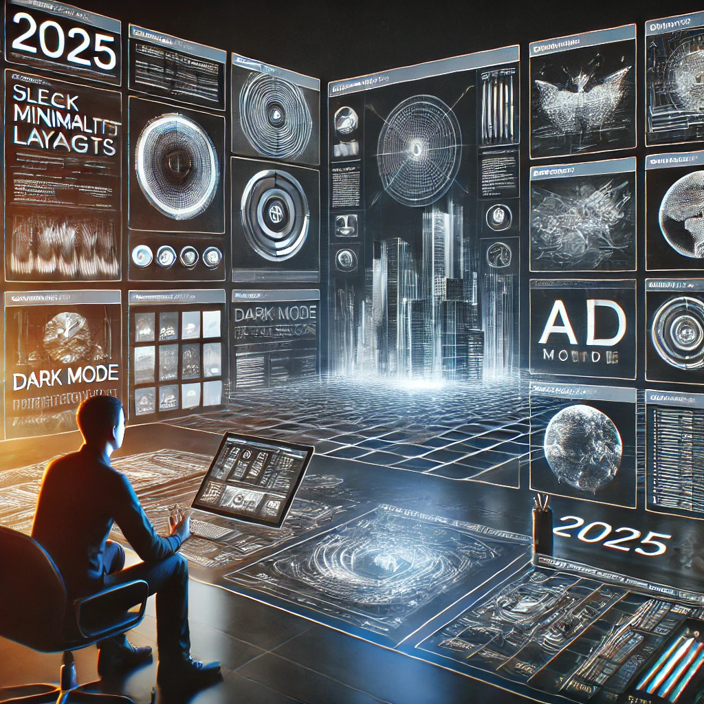
    2. Dark Mode and Personalized Themes

    • Dark Mode continues to grow in popularity.
    • Allows user to change theme for improved UX.
    • Energy efficiency of OLED screens when using dark interface.

    3. Minimalism and Clean Design

    • The principle “Less is More” – fewer elements, more functionality.
    • Simple navigation and clear CTA buttons.
    • Using plenty of white space to improve the perception of content.

    4. Neural Interfaces and No-Click Control

    • Development of technologies for control through gaze and gestures.
    • Integration with augmented and virtual reality devices.
    • Optimized for people with disabilities.

    5. 3D and Interactive Animations

    • Using WebGL and CSS animations to create live interfaces.
    • Interactive elements that respond to user behavior.
    • Gamification of UI to increase user engagement.

    6. Speed and Performance

    • Using lazy loading technology to increase page loading speed.
    • Using CDN and efficient image compression (WebP, AVIF).
    • Lightweight JavaScript frameworks (Svelte, Alpine.js).

    7. Hybrid and Progressive Web Apps (PWA)

    • Progressive Web Apps (PWA) are becoming the standard.
    • Offline access and content caching.
    • Improve user experience by working without downloading.

    8. Personalization and Dynamic Content

    • AI analysis of user behavior for content adaptation.
    • Interactive elements that adapt to user preferences.
    • Implementation of “smart” forms technology and personalized landing pages.

    Conclusion

    The future of web design will be defined by a combination of innovation, usability, and speed. The development of AI, interactive elements, and personalized interfaces will lead to more intuitive and responsive web solutions. Follow the trends and implement new technologies to stay ahead of the competition!

    Related news

    Cases
    Projects
    Ui/ux
    Cases
    Projects
    Ui/ux
    Cases
    Projects
    Ui/ux
    Cases
    Projects
    Ui/ux
    Тренды веб-дизайна 2025: что ожидать?
    UX/UI Design 3 min read

    Web Design Trends 2025: What to Expect?

    Introduction

    Every year, new trends emerge in the world of web design that change the perception of websites and improve user experience. In 2025, trends will focus on improving user interaction, minimalism, and technological innovation. In this article, we will analyze the main web design trends that will be relevant in the coming years.

    1. Minimalism and Simplicity

    • In 2025, the design will become even cleaner and more functional.
    • Simple interfaces with a minimum of distracting elements.
    • Clear structures and contrasting fonts for easy reading.

    2. Dark Mode and Personalization

    • Users are increasingly choosing dark mode, and designers are adapting their solutions to this trend.
    • Websites will offer personalized themes, allowing users to customize the color scheme to suit their needs.
    • Improved visual perception and reduced eye strain.

    3. 3D Elements and Animation

    • Web design actively integrates 3D graphics to increase engagement.
    • Interactive elements with smooth animations improve user experience.
    • Using WebGL and CSS animations to create dynamic effects.

    4. Artificial Intelligence and Automation

    • AI will help create personalized user interfaces.
    • Chatbots with the ability to anticipate customer needs.
    • Automate design through AI-generated layouts and styles.

    5. Voice Interfaces and VR/AR

    • The development of voice search requires adapting design to voice interfaces.
    • Using VR/AR technologies to create interactive pages.
    • Improve navigation with voice commands.

    6. Microinteractions and Dynamic Adaptation

    • Click animations, smooth transitions and interactive elements make the site more convenient.
    • Dynamically change the interface depending on user behavior.
    • Instant feedback for improved UX.

    7. Flexibility and Adaptability

    • Support for various device form factors, including flexible displays.
    • Responsive design is becoming the standard, especially with the rise of mobile users.
    • Optimization for wearables (smart watches, augmented reality glasses).

    Conclusion

    2025 will bring even more technology and personalization opportunities to web design. Minimalism, interactivity, artificial intelligence, and 3D elements will define the trends of the future. Keep an eye on new developments to keep your website modern and user-friendly!

    Related news

    Cases
    Projects
    Ui/ux
    Cases
    Projects
    Ui/ux
    Cases
    Projects
    Ui/ux
    Cases
    Projects
    Ui/ux
    Как выбрать идеальную цветовую палитру для вашего сайта
    UX/UI Design 4 min read

    How to Choose the Perfect Color Palette for Your Website

    Introduction

    The color palette plays a key role in the user experience of a website. The right choice of colors affects readability, aesthetics, and even conversion rates. In this article, we will look at how to choose harmonious color schemes and what tools will help you do this.

    1. Why is color palette important?

    • Creates a first impression: Users rate a site in seconds.
    • Affects brand perception: Colors can be associated with certain emotions and values.
    • Improves readability: Proper contrast makes content easy to perceive.
    • Improves user experience (UX): harmonious color combinations make navigation intuitive.

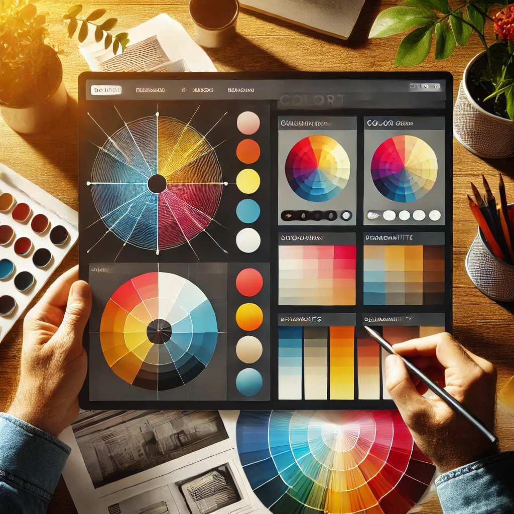
    2. Basic color schemes

    1. Monochrome scheme

    • Uses different shades of the same color.
    • Gives the site an elegant and minimalistic look.
    • Examples: sites in shades of gray or blue.

    2. Complementary scheme

    • Combines two opposite colors on the color wheel.
    • Creates high contrast and dynamism.
    • Example: blue and orange, red and green.

    3. Analog circuit

    • Uses adjacent colors on the color wheel.
    • Creates soft and harmonious combinations.
    • Example: blue, light blue and green.

    4. Triadic diagram

    • Includes three colors equidistant on the color wheel.
    • Balances contrast and harmony.
    • Example: red, yellow and blue.

    3. How to choose a color palette?

    1. Define your brand mission and values

    • Choose colors that reflect your niche.
    • For example, green is associated with ecology, and blue - with reliability.

    2. Research your target audience

    • Young people prefer bright and energetic colors.
    • Business audiences tend to prefer subdued and professional tones.

    3. Use the 60-30-10 rule

    • 60% - the main color.
    • 30% - additional color.
    • 10% – accent color (for buttons, links and CTA).

    4. Check the contrast

    • Make sure the text is easy to read against the background.
    • Use tools like Contrast Checker or WCAG Guidelines.

    4. Useful tools for color selection

    • Adobe Color – color scheme generator.
    • Coolors – quick selection of harmonious combinations.
    • Paletton – creation of complex color combinations.
    • Material Design Color Tool – selection of colors for UI/UX design.

    Conclusion

    The right choice of color palette affects brand perception, website usability and conversions. Use the suggested methods and tools to create a harmonious and attractive web design. Color is a powerful tool that can make your website unique and memorable!

    Related news

    Cases
    Projects
    Ui/ux
    Cases
    Projects
    Ui/ux
    Cases
    Projects
    Ui/ux
    Cases
    Projects
    Ui/ux
    Как правильно использовать анимацию на веб-сайте
    UX/UI Design 4 min read

    How to Use Animation Properly on a Website

    Introduction

    Animation plays an important role in web design, improving user experience and engaging visitors. However, when used incorrectly, animation can have the opposite effect, slowing down the site and overloading the user experience. In this article, we will look at animation best practices and how to use them effectively.

    1. Why do you need animation in web design?

    • Attracting attention: Animation helps to focus attention on important elements.
    • Improved navigation: Smooth transitions make interaction with the site more intuitive.
    • Brand creation: Unique animation can make a website memorable.
    • Simplifying perception: Dynamic hints help users navigate faster.

    2. Types of animation and their use

    1. Loading animation

    • Used to keep users' attention while content is loading.
    • Examples: loading indicators, content skeletons.

    2. Transition animation

    • Makes navigation smooth and convenient.
    • Examples: fade-in effect when changing pages, sliders.

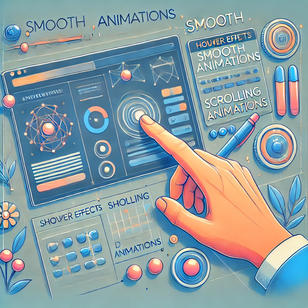
    3. Hover effects

    • Emphasize interactive elements (buttons, links, product cards).
    • Example: changing the color of a button on hover.

    4. Scrolling with animation

    • Creates the effect of elements gradually appearing as you scroll the page.
    • Used to increase engagement.

    5. Microinteractions

    • Improve user experience with small but useful effects.
    • Examples: animation of the "Add to cart" button, form response when entering data.

    3. Best Animation Practices

    1. Minimalism

    • Don't overload your site with excessive animation.
    • Use only those effects that improve UX.

    2. Performance Optimization

    • Animation should not slow down the site.
    • Use CSS animations instead of JavaScript where possible.
    • Minimize the use of heavy files (GIFs, video backgrounds).

    3. Harmony and consistency

    • Animation should be natural and consistent with the brand style.
    • Use the same effects for the same elements (for example, all buttons with the same hover effect).

    4. Availability

    • Add the ability to disable animation for users with disabilities.
    • Make sure the content is accessible without animation.

    4. Tools for creating animation

    • CSS animations (keyframes, transitions) - light and fast effects.
    • JavaScript libraries (GSAP, Anime.js) – complex interactive animations.
    • LottieFiles – SVG animation with minimal impact on performance.
    • Frame Motion – a tool for creating animated interfaces in React.

    Conclusion

    Animation is a powerful tool in web design that, when used correctly, improves the user experience. Follow the principles of minimalism, optimization, and accessibility to create a beautiful and user-friendly website with smooth animations.

    Related news

    Cases
    Projects
    Ui/ux
    Cases
    Projects
    Ui/ux
    Cases
    Projects
    Ui/ux
    Cases
    Projects
    Ui/ux
    Роль типографики в веб-дизайне: как выбрать шрифты для сайта
    UX/UI Design 3 min read

    The Role of Typography in Web Design: How to Choose Fonts for Your Website

    Introduction

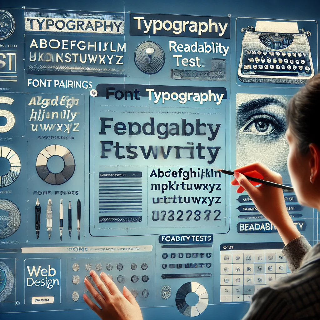
    Typography is one of the most important elements of web design, affecting the perception of content, readability and overall aesthetics of the site. In this article, we will look at the principles of choosing fonts, their combinations and best practices for use in web design.

    1. Why is typography important?

    • Readability: A well-chosen font improves the perception of information.
    • Visual hierarchy: Font size and style help users navigate content.
    • Corporate identity: Fonts help create a unique and recognizable brand.
    • Impact on conversion: Readable and attractive copy retains users and increases engagement.

    2. Basic principles of choosing fonts

    1. Simplicity and conciseness

    • Do not use more than 2-3 fonts on the site.
    • Choose fonts with high legibility (sans serif, clear lines).

    2. Compatibility with different devices

    • Use web fonts (Google Fonts, Adobe Fonts).
    • Check how fonts display on mobile and desktop screens.

    3. Contrast and hierarchy

    • Use different sizes and weights for headings, subheadings, and body text.
    • Contrasting fonts attract attention and make text easier to read.

    3. Popular Font Combinations

    1. Classic combination (Readability and professionalism)

    • Headlines: Playfair Display (serif).
    • Main text: Lato (sans serif).

    2. Modern style (Minimalism and elegance)

    • Headlines: Montserrat.
    • Main text: Open Sans.

    3. Contrasting combination (Dynamics and expressiveness)

    • Headlines: Oswald (narrow, expressive).
    • Main text: Roboto.

    4. Best Practices for Using Fonts in Web Design

    • Use line spacing of 1.4–1.6 for better readability.
    • Minimize the use of decorative fonts.
    • Optimize font loading for site speed.
    • Make sure text contrast meets WCAG standards.

    5. Typography tools

    • Google Fonts – free web fonts.
    • Adobe Fonts – premium fonts for designers.
    • Font Pair – a selection of the best font combinations.
    • WhatFont (Chrome Extension) – allows you to determine the font used on any site.

    Conclusion

    Typography is not just about choosing beautiful fonts, but a tool that influences the usability and perception of a website. Following the principles of contrast, readability and compatibility, you can create a harmonious and professional web design.

    Related news

    Cases
    Projects
    Ui/ux
    Cases
    Projects
    Ui/ux
    Cases
    Projects
    Ui/ux
    Cases
    Projects
    Ui/ux
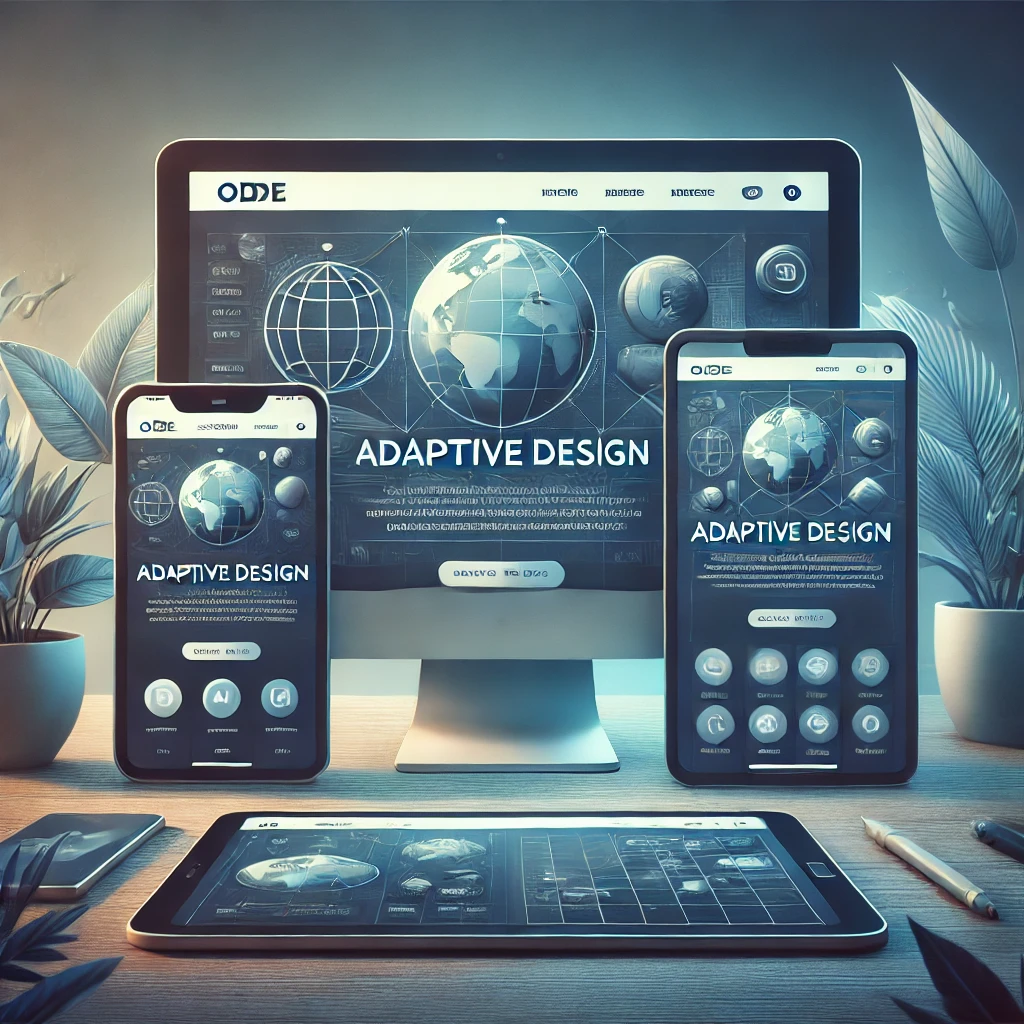
    Что такое адаптивный дизайн и почему он критически важен?
    UX/UI Design 4 min read

    What is responsive design and why is it critical?

    Introduction

    In today's digital world, users access websites from a variety of devices - smartphones, tablets, laptops, and even smart TVs. If a website is not adapted to different screens, this can lead to loss of customers and a decrease in conversion. In this article, we will analyze what adaptive design is, why it is important, and how to implement it correctly.

    1. What is responsive design?

    Responsive design is a method of developing websites in which the layout automatically adjusts to the screen size of the device. This ensures a comfortable user experience regardless of the type of device.

    Basic principles of responsive design:

    • Flexible grid systems – changing the content structure depending on the screen width.
    • Media queries (CSS media queries) – customize styles depending on device size.
    • Flexible images and media – scaling of images and videos for correct display on different screens.
    • Mobile menu – simplified navigation for easy use on small screens.

    2. Why is responsive design so important?

    2.1. Improving user experience

    • Visitors receive convenient navigation and comfortable viewing of content on any device.
    • Reduces the likelihood of failures due to an inconvenient interface.

    2.2. Improving Search Engine Rankings (SEO)

    • Google gives priority to sites with responsive design.
    • Mobile-first indexing improves mobile rankings.

    2.3. Saving resources on development

    • There is no need to create a separate mobile version of the site.
    • Maintaining a single code base simplifies content support and updates.

    2.4. Increase conversion and sales

    • Ease of use increases the likelihood of completing target actions (purchase, registration).
    • Adaptation for mobile payments makes the ordering process easier.

    3. How to implement responsive design?

    3.1. Using frameworks

    • Bootstrap – ready-made adaptive grids and components.
    • Foundation – a powerful tool for flexible layouts.

    3.2. Correct content structure

    • Mobile-First Design.
    • Logical navigation and convenient buttons for mobile users.

    3.3. Image and Media Optimization

    • Use WebP and SVG formats for fast loading.
    • Lazy loading to speed up the site.

    3.4. Testing on different devices

    • Testing operation on emulators (Chrome DevTools, BrowserStack).
    • Testing loading speed with Google PageSpeed Insights.

    4. Mistakes to Avoid

    • Too complex layouts, which complicate perception on mobile devices.
    • Incorrect font sizes, which are difficult to read on small screens.
    • Using Flash and outdated technologies, which are not supported by modern browsers.
    • Lack of testing, which leads to bugs and inconvenience for users.

    Conclusion

    Adaptive design is not just a trend, but a necessity for any modern website. It improves user experience, increases SEO positions and increases conversion. If your website is not yet adapted for mobile devices, it's time to think about updating it!

    Related news

    Cases
    Projects
    Ui/ux
    Cases
    Projects
    Ui/ux
    Cases
    Projects
    Ui/ux
    Cases
    Projects
    Ui/ux
    Get a detailed and clear commercial offer

    We transform your business!


      By clicking the “Submit” button, you agree to
      processing of personal data. Read more