Introduction
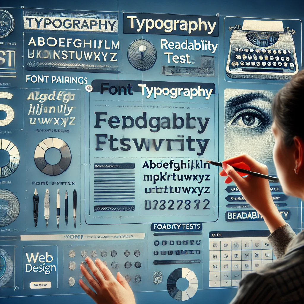
Typography is one of the most important elements of web design, affecting the perception of content, readability and overall aesthetics of the site. In this article, we will look at the principles of choosing fonts, their combinations and best practices for use in web design.
1. Why is typography important?
- Readability: A well-chosen font improves the perception of information.
- Visual hierarchy: Font size and style help users navigate content.
- Corporate identity: Fonts help create a unique and recognizable brand.
- Impact on conversion: Readable and attractive copy retains users and increases engagement.
2. Basic principles of choosing fonts
1. Simplicity and conciseness
- Do not use more than 2-3 fonts on the site.
- Choose fonts with high legibility (sans serif, clear lines).
2. Compatibility with different devices
- Use web fonts (Google Fonts, Adobe Fonts).
- Check how fonts display on mobile and desktop screens.
3. Contrast and hierarchy
- Use different sizes and weights for headings, subheadings, and body text.
- Contrasting fonts attract attention and make text easier to read.
3. Popular Font Combinations
1. Classic combination (Readability and professionalism)
- Headlines: Playfair Display (serif).
- Main text: Lato (sans serif).
2. Modern style (Minimalism and elegance)
- Headlines: Montserrat.
- Main text: Open Sans.
3. Contrasting combination (Dynamics and expressiveness)
- Headlines: Oswald (narrow, expressive).
- Main text: Roboto.
4. Best Practices for Using Fonts in Web Design
- Use line spacing of 1.4–1.6 for better readability.
- Minimize the use of decorative fonts.
- Optimize font loading for site speed.
- Make sure text contrast meets WCAG standards.
5. Typography tools
- Google Fonts – free web fonts.
- Adobe Fonts – premium fonts for designers.
- Font Pair – a selection of the best font combinations.
- WhatFont (Chrome Extension) – allows you to determine the font used on any site.
Conclusion
Typography is not just about choosing beautiful fonts, but a tool that influences the usability and perception of a website. Following the principles of contrast, readability and compatibility, you can create a harmonious and professional web design.